The Problem...
One of the most frustrating things about being a skater today, is this "new world" of ours called "Online Shopping". Not that it's all bad, by any means. Indeed, it's pretty damned handy, most of the time. It oftentimes allows us... that is, "demanding, old geezers (like me)"... to find highly specialized products quickly and easily, that might not be readily available (or, available at all) at our local, brick-and-mortar skate shops. And, it offers the convenience of shop-from-home-in-your-boxers comfort, and speedy, to-your-door delivery.
But: Most of the manufacturers and online retailers already know all of these benefits. That's why, they're forging such a huge presence on the world wide web.
However: What they don't seem to understand, are some of the frustrations that go along with online shopping. Namely: Not really knowing (understanding) what it is that you're looking at. Let alone, buying.
Most "product shots" that we, as consumers, are presented with online are the standard, not-very-telling "bottom" shots of decks, or "face" shots of wheels. Both are basically designed to show us what the graphics are... but, not a hell of a lot more.
The problem is, I believe that only a very small of skaters (ie, "the clueless ones") buy skateboard equipment strictly based on graphics, and graphics alone. Especially here in the "niche" market... here, we tend to have much older skaters that [generally] have very specific ideas about what they want and/or need... and therefore, they also tend to know what it is that they're looking for. If the "picture" on your website isn't very descriptive, and/or informative... the net result is more often than not, that this sort of skater will go looking elsewhere. Which generally loses you, a sale.
The Answer...!
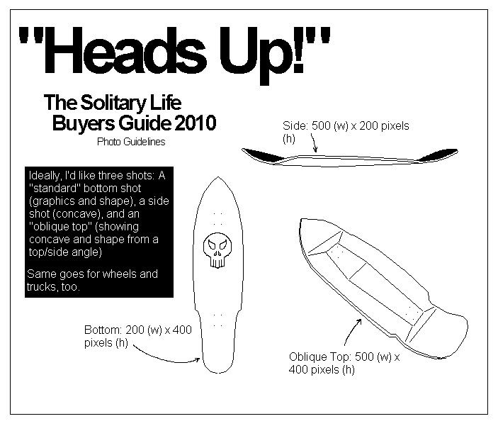
The answer to these problems is easy enough: Just, take more pictures for your websites! A fairly good start/rule-of-thumb might be, to use the guidelines that we came up with here at The Solitary Life, for our "Heads Up!" Buyers Guide.

Here they are, "the guidelines" that we've been sending out to the manus, for inclusion into the Buyers Guide. The "oblique" shots are usually the most "telling", giving a nearly three-dimensional perspective, via a two-dimensional photo. This helps us- the customers- get a much, much better grasp on what it is that we're truly looking at (or, purchasing...)
Also note: The size of this "photo". Details matter, when you're making and selling quality products. The ability to "see" those details, of course, matters just as much...
The more information that you guys... the retailers, the manus... can pack into your websites, the more likely it will be that your customers feel confident enough to make truly informed buying decisions. And confident, truly informed customers tend to be freer-spending ones, I might add. Simply because, there's very little doubt left to get between the initial desire, and the ultimate purchase. It's minimizing this "buyers doubt" that is the ultimate goal of more generous and thorough product-shots.
But, don't believe me, or even take my solitary word for it. Scan any days' worth of dialogue on Silverfish (www.silverfishlongboarding.com) or Skull and Bones (www.skullandbonesskateboards.com), and you'll find at least one dude... but, more than likely, many dudes... asking the same sorts of questions. "How big is that?!", or, "What's the wheelbase?!". And, more often than not: "Hey! Y'got a pic of that, by any chance...!?"
Manufacturers: Help Us Surrender Our Cash To You! Give Us The Photos! Please. You'll only be helping yourselves in the end.
